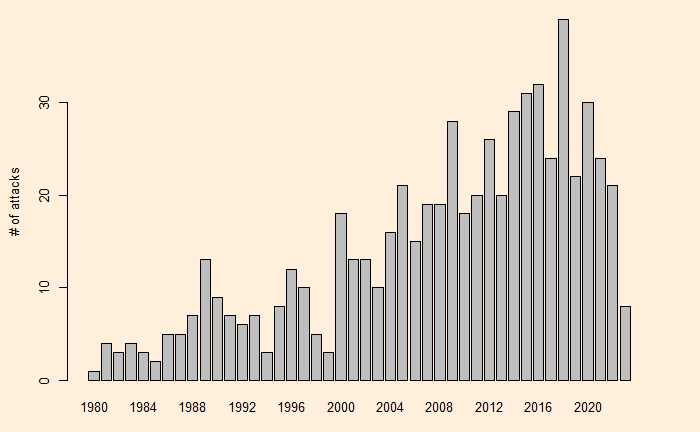
We have seen randomness explaining the ‘trends’ in shark attacks in South Africa. The next one is Australia. Here is the scatter from 1980-2023.
Scatter plot

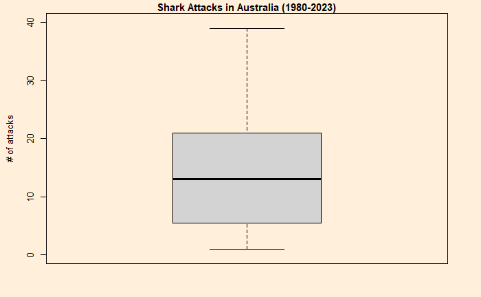
It looks like two different clusters or trends, as apparent from the plot, and the change point may have happened sometime in 2000. Another way of visualising the statistical summary is to build boxplots.
Boxplot summary


A t-test is handy here to test the hypothesis (that the two trends are just by chance or not).
T-test
Aus_before <- inv_afr$AUS[which(inv_afr$Year < 2000)]
Aus_after <- inv_afr$AUS[which(inv_afr$Year > 1999)]
t.test(Aus_before, Aus_after, var.equal = TRUE)
Two Sample t-test
data: Aus_before and Aus_after
t = -8.6826, df = 42, p-value = 6.378e-11
alternative hypothesis: true difference in means is not equal to 0
95 percent confidence interval:
-19.28749 -12.01251
sample estimates:
mean of x mean of y
5.85 21.50 Comparison with South Africa

	Two Sample t-test

data:  SA_before and SA_after
t = 1.2881, df = 42, p-value = 0.2048
alternative hypothesis: true difference in means is not equal to 0
95 percent confidence interval:
 -0.8406907  3.8073574
sample estimates:
mean of x mean of y
 7.900000  6.416667
Unsurprisingly, the results show a p-value higher than the significant value (e.g., 0.05).

