Let’s apply what we learned in the ‘mtcars’ data. We use R to perform the calculations. We require two packages, ‘stats’ and ‘ggbiplot’, to do the job.
library(stats)
library(ggbiplot)
Start with the simplest first – two variables – mpg and disp
data("mtcars")
car_data <- mtcars
mtcars.pca <- prcomp(car_data[,c(1,3)], center = TRUE,scale. = TRUE)
ggbiplot(mtcars.pca,
  ellipse = TRUE,
  labels = rownames(car_data)
)
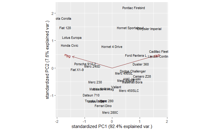
You can see a few clusters – things on the right, left and centre. You can also see two arrows, one corresponding to mpg and another to disp. It’s true we don’t need to do a PCA for two variables; a 2-D can do the job already.

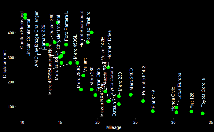
You can already start interpreting the PCA plot. The Cadilac and Lincoln are closer to the disp line in the PCA plot, which is towards the northwest of the Displacement vs Mileage plot. On the other hand, Honda, Porche etc., are closer to the mpg axis.
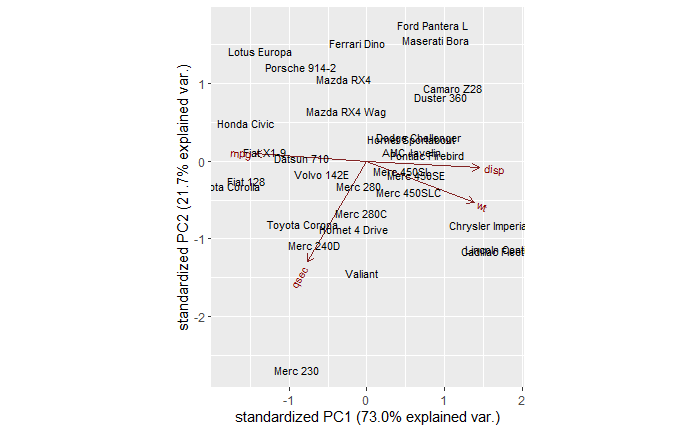
mtcars.pca <- prcomp(car_data[,c(1,3, 6, 7)], center = TRUE,scale. = TRUE)
ggbiplot(mtcars.pca)
ggbiplot(mtcars.pca,
  ellipse = TRUE,
  labels = rownames(car_data)#,
)

