The news that India has overtaken China as the most populous country in the world sparked a flurry of debates in the public discourse. And, as usual, many of them instilling fear and aimed at demonising specific communities. But, as we have seen before, the data was not as bad as one would imagine.
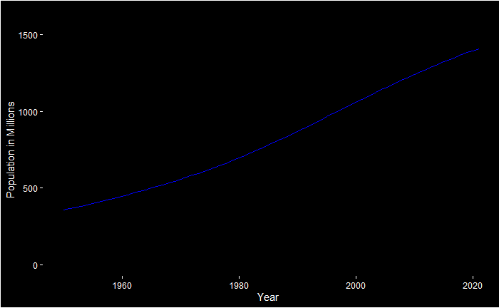
And the reason is visible in the following plot. You may see an inflection point, denoting a change in growth rate (not absolute growth). The location of inflection is estimated using R with the help of the package “inflection”.
x = in_pop$Year[1:72]
y = in_pop$All[1:72]/1e6


plot(x,y,cex=0.3,pch=19, ylab = "Population in Millions", xlab = "Year", ylim = c(0, 1500), col = "blue", type ="l", lwd=3)
grid()

bb <- ese(x,y,0)
pese <- bb[,3]

abline(v=pese, col="red", lwd=2, lty=2)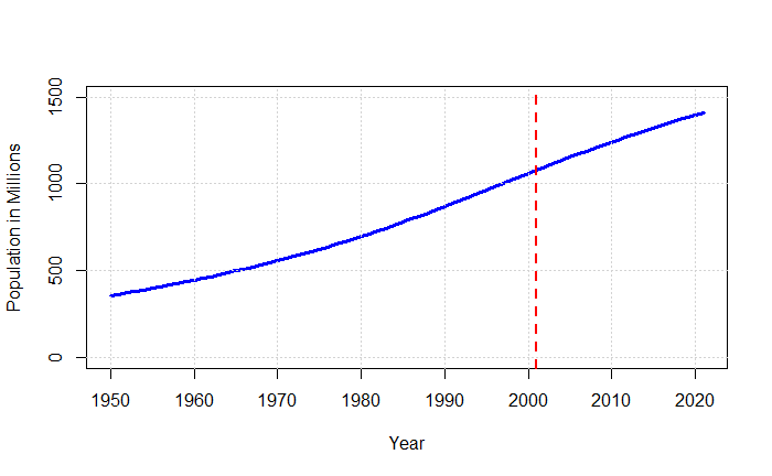
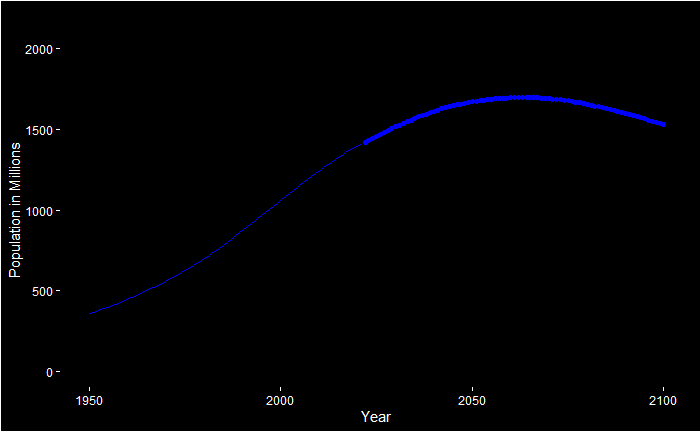
And this will lead to an eventual peak and a further decline, as per projections.
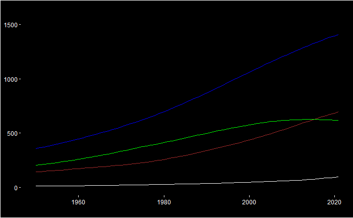
In the following plot, you will see what happens to the different age groups. The under-25 (green) has already peaked, 25-65 (brown) will be in a couple of decades from now and the old (> 65, white) to stay flat by the end of this millennium.
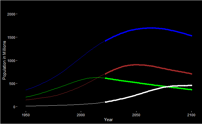
India’s population growth will come to an end: Our World in Data

