In exploratory data analyses, you may want to check the correlations – the strength and the direction – in one go. And a correlation matrix can give that snapshot. Following is the R code to get the matrix.
corrplot(corr = cor(car_data), method = 'number')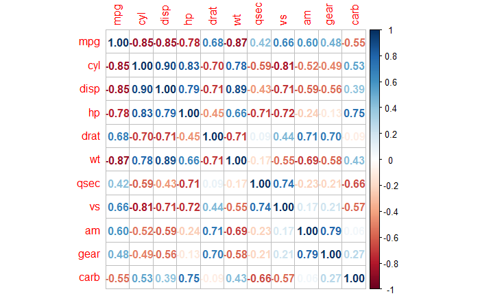
As we discussed in the previous posts, a higher positive number (blue) denotes a stronger positive correlation between the variables (pairwise), and the negative (red) indicates the opposite.
Let’s work on various other ways of visualising the same using R.
As a colour map
corrplot(corr = cor(car_data), method = 'color')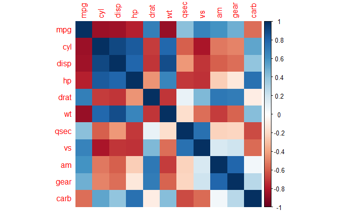
As a pie chart and labels inside
corrplot(corr = cor(car_data), method = 'pie', tl.pos = 'd')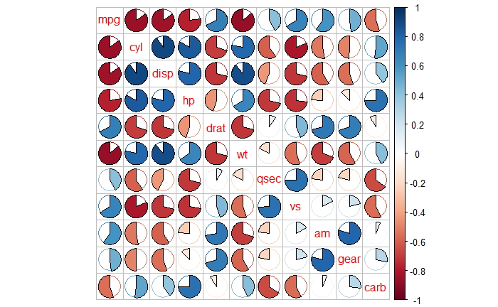
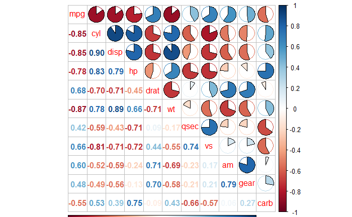
Having mixed visualisations for upper and lower triangles
corrplot(cor(car_data), type = 'upper', method = 'pie', tl.pos = "d")
corrplot(cor(car_data), type = 'lower', method = 'number', add = TRUE, tl.pos = "n", diag = FALSE)