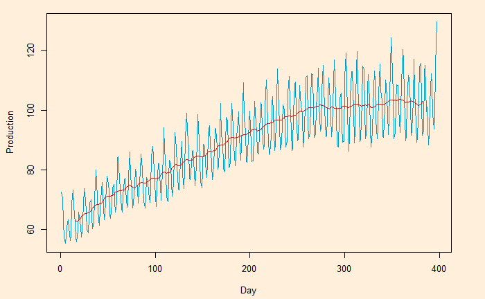
Here, we plot the daily electricity production data that was used in the last post.

Following is the R code, which uses the filter function for building the 2-sided moving average. The subsequent plot represents the method on the first five points (the red circle represents the centred average of the first five points).
E_data$ma5 <- stats::filter(E_data$IPG2211A2N, filter = rep(1/5, 5), sides = 2)
For the one-sided:
E_data$ma5 <- stats::filter(E_data$IPG2211A2N, filter = rep(1/5, 5), sides = 1)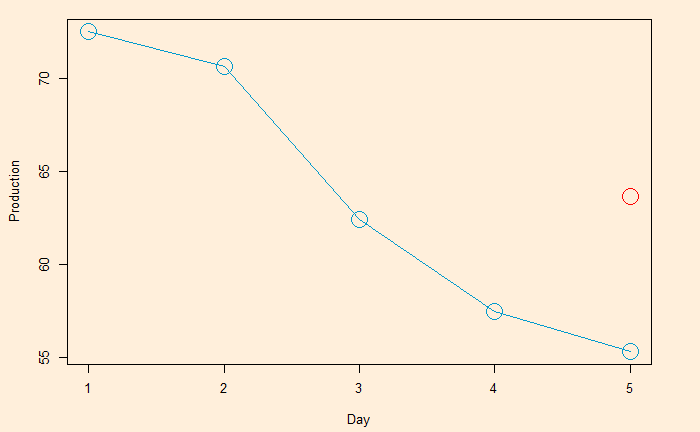
The 5-day moving average is below.

You can get a super-smooth data trend using the monthly (30-day) moving average.