We have seen logistic regression as a means to estimate the probability of outcomes in classification problems where the response variable has two or more values. We use the ‘Default’ dataset from ‘ISLR2’ to illustrate. The data set contains 10000 observations on the following four variables:
default
: A factor with levels No and Yes indicating whether the customer defaulted on their debt
student:
factor with levels No and Yes indicating whether the customer is a student
balance:
The average balance that the customer has remaining on their credit card after making their monthly payment
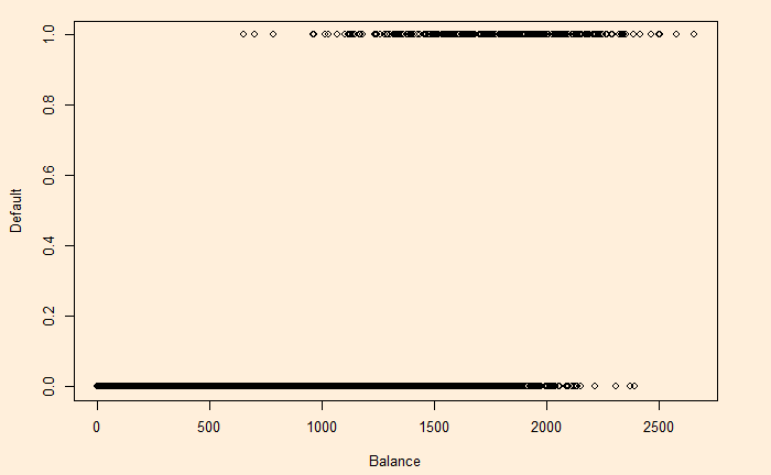
income: Income of customerWe change YES to 1 and NO to 0 and plot default vs balance.
Let p(X) be the probability that Y = 1 given X. The simple form that fits this behaviour is:

The beta values (the intercept and slope) are obtained by the ‘generalised linear model’, glm function in R.
D_Data <- Default
D_Data$def <- ifelse(D_Data$default=="Yes",1,0)
model <- glm(def ~ balance, family = binomial(link = "logit"), data = D_Data)
summary(model)
Call:
glm(formula = def ~ balance, family = binomial(link = "logit"),
    data = D_Data)

Deviance Residuals:
    Min       1Q   Median       3Q      Max
-2.2697  -0.1465  -0.0589  -0.0221   3.7589

Coefficients:
              Estimate Std. Error z value Pr(>|z|)
(Intercept) -1.065e+01  3.612e-01  -29.49   <2e-16 ***
balance      5.499e-03  2.204e-04   24.95   <2e-16 ***
---
Signif. codes:  0 ‘***’ 0.001 ‘**’ 0.01 ‘*’ 0.05 ‘.’ 0.1 ‘ ’ 1

(Dispersion parameter for binomial family taken to be 1)

    Null deviance: 2920.6  on 9999  degrees of freedom
Residual deviance: 1596.5  on 9998  degrees of freedom
AIC: 1600.5

Number of Fisher Scoring iterations: 8
Now, we will test how good the model predictions are by plotting the function using the regressed beta0 ( = -10.65) and beta1 (= 0.0055).
plot(D_Data$balance, D_Data$def, xlab = "Balance", ylab = "Default")

y <- function(x){
  exp(-10.65+0.0055*x) / (1 + exp(-10.65+0.0055*x))
}

x <- seq(0, 3000)
lines(x, y(x), col = "red")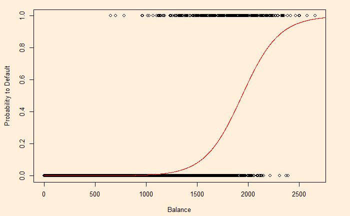
But R has an even simpler way to get this curve.
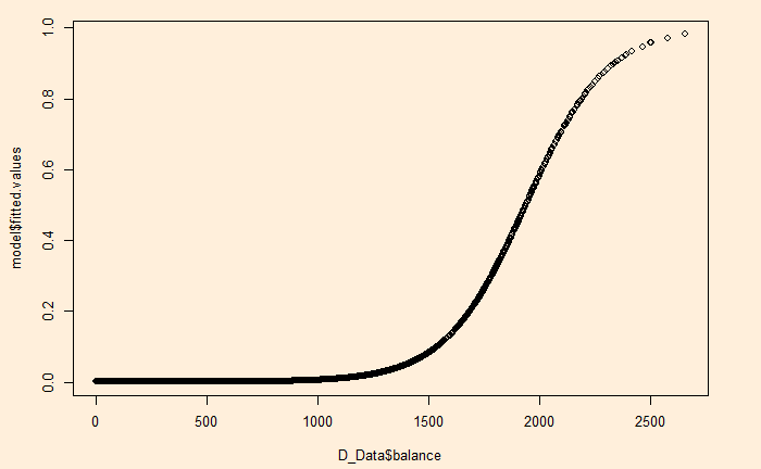
plot(D_Data$balance, model$fitted.values)