Consider two possible prevalence values for a rare disease, 0.07 and 0.08, respectively. If 100 samples from each city are taken, and six people are found positive, which prevalence value is likely?
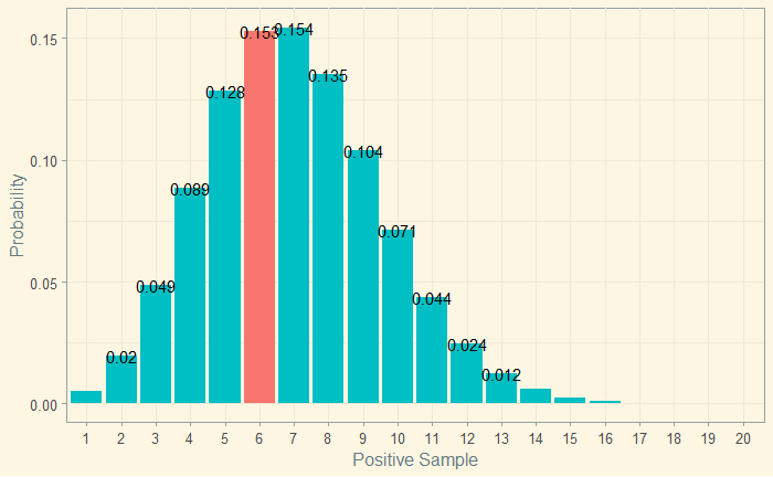
Let’s visualise the situation 1:

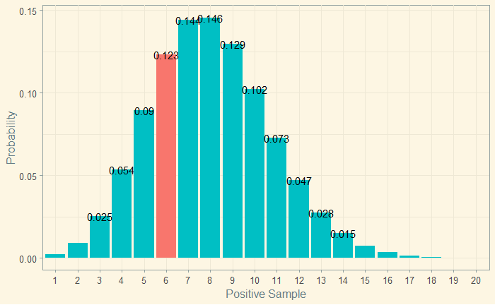
And the situation 2:

It is clear that the first possibility, the prevalence (‘the parameter’) 0.07, is more likely, given 6 people tested positive as probability = 0.153 for the first case is > 0.123 for the second.
Summarising: for the parameter of 7%, the probability of getting six out of a hundred is 0.153. It becomes the likelihood.
L(theta = 0.07; y = 6) = 0.153 and L(theta = 0.08; y = 6) = 0.123
Here is the R code that generated the plot in situation 2.
xx <- seq(1,20)
P <-  dbinom(xx, 100, prob = 0.08)
binom_data <- data.frame(xx, P)

binom_data %>%  ggplot(aes(x=xx, y=P, label=P, fill=factor(ifelse(xx==6,"Highlighted","Normal")))) +
  geom_bar(stat="identity", show.legend = FALSE) +
  geom_text(aes(label=factor(ifelse(P > 0.01, round(P, 3),"")))) +
  scale_x_discrete(name = "Positive Sample", limits=factor(seq(1, 20, 1))) +
  scale_y_continuous(name = "Probability") +
theme_solarized(light = TRUE) 
