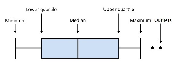
The boxplot is my favourite plot. The plot can summarise and maintain the statistical perspective by showing the data distribution. So, what is a boxplot? The following picture explains it.
Now, let’s apply the plot to COVID-19 deaths. The data summarises the distribution of COVID deaths from its beginning. Data comes from the Covid dashboard of the Government of Kerala.
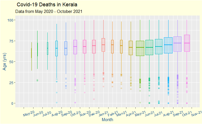
First, it is a time series organised monthly. The box’s width represents the total number of deaths in that month. The ‘boxes’ take you through the time of the first wave and the second one caused by the Delta (B.1.617.2) variant.
Broad Observations
The number of deaths shot up from May 2021, the start of the fast-spreading second wave of infection.
The median age of the deceased did not show any reduction after May 2021 (after the arrival of the delta), dismissing speculations on the deadliness of the new strain.
The median age of death marginally dropped starting in March, which coincided with the vaccination program for the elderly. The number systematically increased after June, coinciding with the younger population taking the vaccination. Note that these are correlations and do not necessarily mean causations!
Deaths for people below the age of 35 years do happen but are rare outliers in the statistics.
The incidence of death may be beginning to ease out towards the end.
If you like the boxplot, here is your bonus plot

The new plot includes the actual data points. More men have died from the disease, and for whatever reason, their median age at death is also a couple of years lower than women.
GoK Dashboard