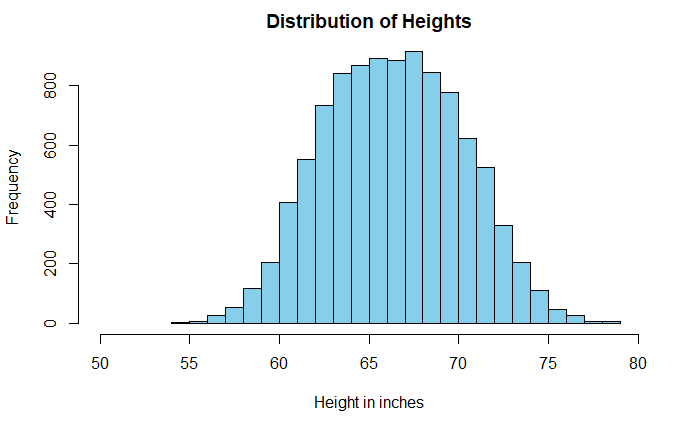
Histograms are a powerful means of understanding the spread of data. Sometimes the shape of the plot can mislead the analysis. A well-known example is the distribution of heights of adults.

The data is taken from Kaggle, but I suspect it comes from simulations and not actual measurements. A casual look at the data suggests a broad dispersion of heights in the centre, with a mean of 66.4 inches (168.6 cm) and a standard deviation of 3.9 inches (9.8 cm).
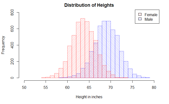
But look what happens when we replace the single plot with two sub-plots based on the key categorical variable, gender.
Pop_data_male <- Pop_data %>% filter(Gender == "Male")
Pop_data_female <- Pop_data %>% filter(Gender == "Female")

hist(Pop_data_male$Height, breaks = 20, col = rgb(0,0,1,1/2), xlim = c(50,80), ylim = c(0,800), density = 20, angle = 135, main = "Distribution of Heights", xlab = "Height in inches", ylab = "Frequency")

hist(Pop_data_female$Height, breaks = 20, add = T, col = rgb(1,0,0,1/2), density = 20,angle = 45)

legend("topright", c("Female", "Male"), fill = c(rgb(1,0,0,1/2), rgb(0,0,1,1/2)),  density = 20, angle = c(45, 135))

