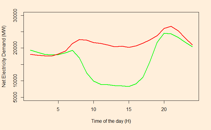
It is the demand curve for electricity net of solar output throughout the day.

The red line describes the demand in 2014 and the green in 2019.
If PV generates more energy than demand – called over-generation – curtailment may happen to the electricity (not stored for future use).

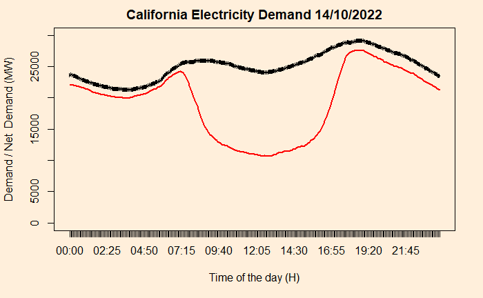
The red line represents the net demand (System demand minus wind and solar), and the black is the system demand.
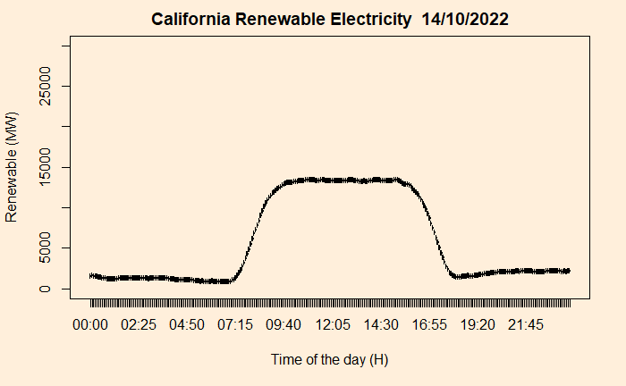
So subtracting the net demand from the total, one can get a decent shape of renewable energy in the Californian electricity market.

Needless to say, solar dominates.
Reference
California duck curve: IEA
Demand trend California: CAISO

