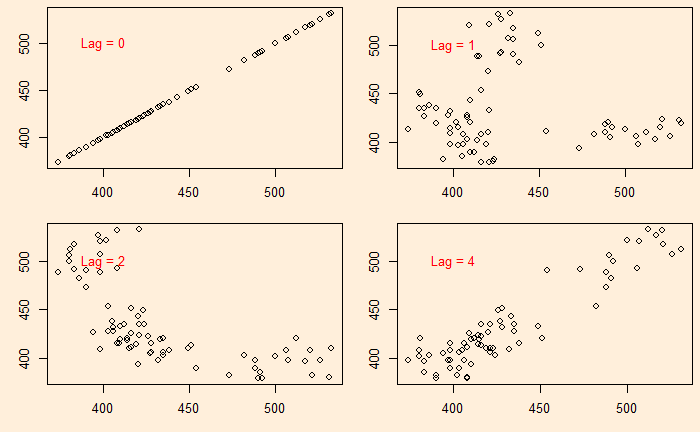
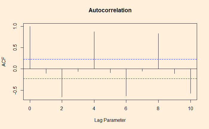
We continue from the Aus beer production data set. In the last post, we manually built scatter plots at a few lags (lag = 0, 1, 2, and 4) and introduced the ‘acf’ function.
There is another R function, ‘gg_lag’, which can be an even better illustration.
new_production %>% gg_lag(Beer)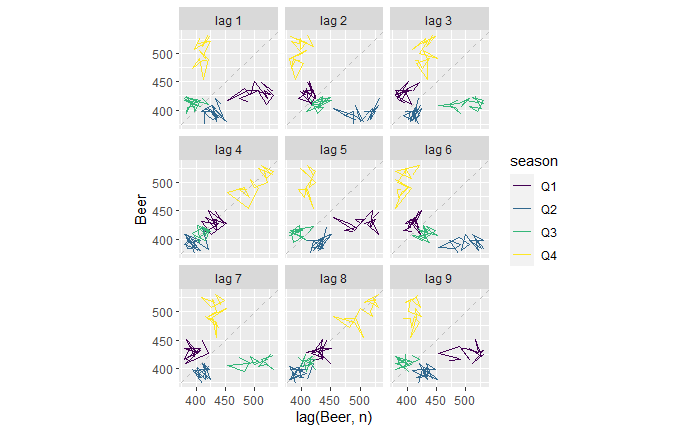
For example, the lag = 1 plot (top left). The yellow cluster represents the plot of Q4 on the Y-axis against Q3 of the same year on the X-axis. On the other hand, the purple cluster represents the plot of Q1 on the Y-axis against Q4 of the previous year on the X-axis.
Similarly, for the lag = 2 plot (top middle), The yellow represents the plot of Q4 against Q2 (two quarters earlier) of the same year. The purple represents the plot of Q1 against Q3 of the previous year.
The lag = 4 plot shows a strong positive correlation (everyone on the diagonal line). This is not surprising; it plots Q4 of one year against Q4 of the previous year, Q1 of one year with Q1 of the previous year, etc.
