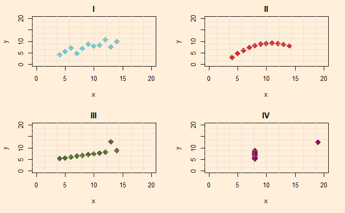
What is so special about the following four scatter plots? Do you see any similarities between them?

Well, all four look different from each other. The first is a scatter plot with a linear trend, the second is a curve, the third represents a straight line with one outlier, and the fourth is a collection of points in a cluster with an extreme outlier. And you are right; they represent four different behaviours or x and y.
Beware of statistical summary
Imagine you don’t get to see how they are organised in the x-y plane, but instead, only the summary statistics, and here they are:
| Property | Value |
| Mean x | 9.0 |
| Mean y | 7.5 |
| Sample variance of x | 11 |
| Sample variance of x | 4.12 |
| Correlation between x and y | 0.816 |
Not over yet!
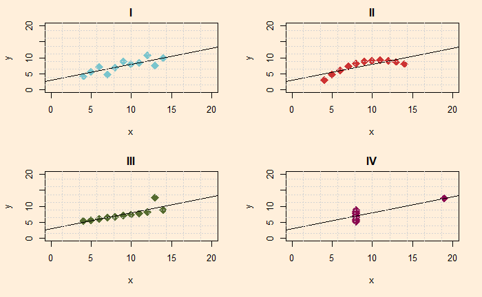
Now put linear regression lines to all.

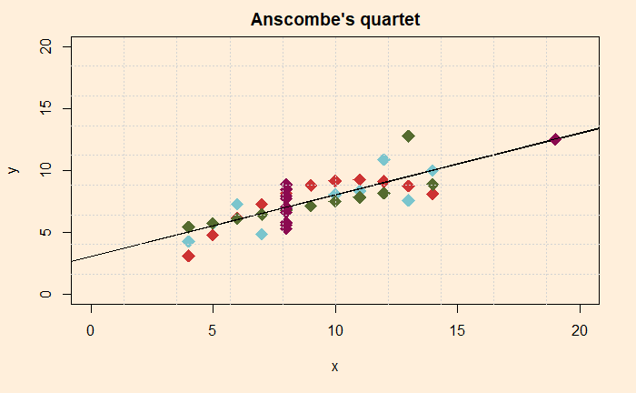
And if you don’t believe me, see all four in one plot with the common linear regression line.

Following is the complete dataset in an R data frame.
Q1 <- data.frame("x" = c(10, 8, 13, 9.0, 11.0, 14.0, 6.0, 4.0, 12.0, 7.0, 5.0), "y" = c(8.04, 6.95, 7.58, 8.81, 8.33, 9.96, 7.24, 4.26, 10.84, 4.82, 5.68))
Q2 <- data.frame("x" = c(10, 8, 13, 9.0, 11.0, 14.0, 6.0, 4.0, 12.0, 7.0, 5.0), "y" = c(9.14, 8.14, 8.74, 8.77, 9.26, 8.10, 6.13, 3.10, 9.13, 7.26, 4.74))
Q3 <- data.frame("x" = c(10, 8, 13, 9.0, 11.0, 14.0, 6.0, 4.0, 12.0, 7.0, 5.0), "y" = c(7.46, 6.77, 12.74, 7.11, 7.81, 8.84, 6.08, 5.39, 8.15, 6.42, 5.73))
Q4 <- data.frame("x" = c(8, 8, 8, 8, 8, 8, 8, 19, 8, 8, 8), "y" = c(6.58, 5.76, 7.71, 8.84, 8.47, 7.04, 5.25, 12.50, 5.56, 7.91, 6.89))
The moral of the story is
Summary statistics are great ways to communicate trends. But, as the reviewer, you must exercise the utmost care in understanding the actual data points.
Anscombe’s quartet: wiki

