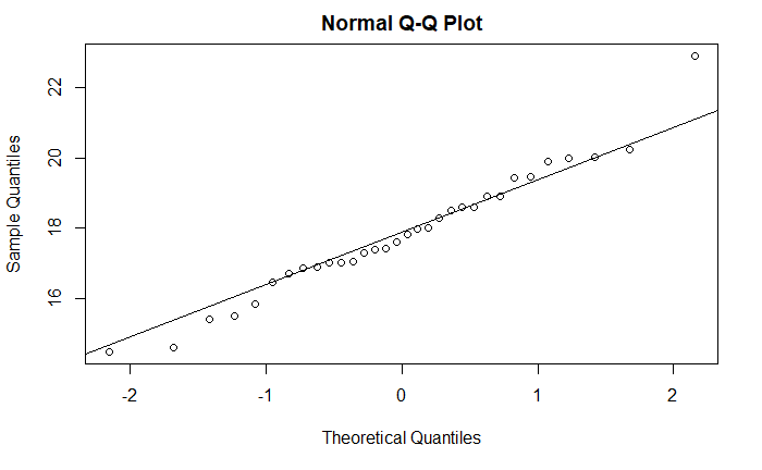
Making a q-q plot is easy in R. Get data, and type a single line command; you’re ready. I will show you the process and the output using the famous mtcars dataset, which is in-built in R. For example, if you want to know the data, qsec, which is 1/4 mile time, of 32 automobiles follows a normal distribution, you type.
qqnorm(mtcars$qsec)
qqline(mtcars$qsec)
These functions are from the stats library. The first line makes the (scatter) plot for your sample, and the second one ( qqline()) makes the line representing the theoretical distribution line, which makes it easier to evaluate whether the points deviate from the reference line.
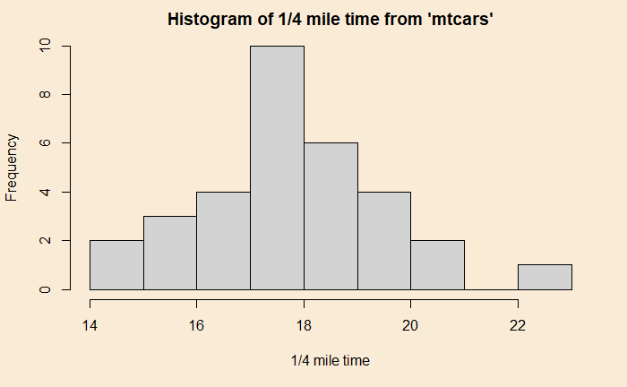
You can see that the qsec data is more or less uniformly distributed, something you may see from the histogram of the data below.

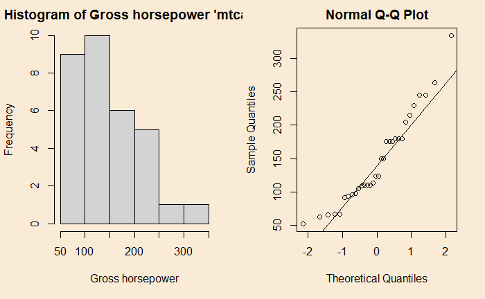
Take a different data which is left-skewed, such as hp, and its qqplot


