The Quantile-Quantile (q-q) plot is a technique for verifying how well your data compares with a given distribution. Quantiles are regular intervals for cutting a probability distribution into equal probability pieces. We have seen before about percentiles, Px, the value below which x percentage (100 portions) of the data lies, and quartiles, which divide the distribution into four equal parts of 25% each (first, second, third, and fourth quartiles).
Distribution
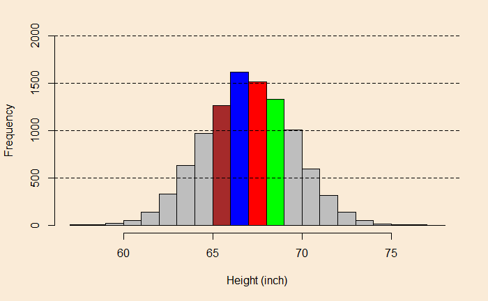
Imagine you collected 10,000 sample data for a parameter, say the height of 10000 adult males, and made a histogram.

You can see that the X-axis describes the height (in inches). Each bin (bar) is one inch wide (X-distance). This is how you interpret the plot: say, the red bin starts at 67, ends at 68, and has a height of 1500 in frequency. This would mean that about 1500 individuals (out of the 10,000) are 67 to 68 inches tall. Similarly, from the brown bucket, there are ca. 1300 males between 65 and 66.
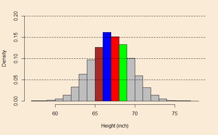
The same graph may be represented with density on the Y-axis instead of frequency.

Using density, we rescale the frequency so that the total area under the curve becomes one, and each bin will provide probabilities of occurrence. For example,
1 x 0.16 + 1 x 0.15 + 1 x 0.125 + 1 x 0.13 + 1 x 0.1 + 1 x 0.1 + 1 x 0.06 + 1 x 0.06 + 1 x 0.025 + 1 x 0.025 + ... = 1Plot against the quantiles
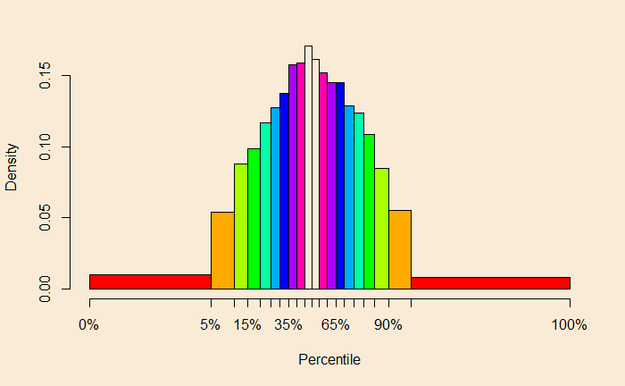
So far, we have used equal quantity for the parameter (height) on the X-axis. We will change it to something different. We will take percentage intervals (a type of quantile). We use 5% intervals, and the height values corresponding to each of the 5% occurrences are tabulated:
| 0% | 5% | 10% | 15% | 20% | 25% | 30% |
| 57.88 | 62.87 | 63.80 | 64.37 | 64.87 | 65.31 | 65.69 |
| 35% | 40% | 45% | 50% | 55% | 60% | 65% |
| 66.05697 | 66.37 | 66.69 | 66.98 | 67.29 | 67.62 | 67.97 |
| 70% | 75% | 80% | 85% | 90% | 95% | 100% |
| 68.31 | 69.10 | 69.56 | 68.70 | 70.15 | 71.06 | 77.55 |
Key observations are 1) the distance between 0 to 5 maybe 5%, but on the scale, it occupies a length of almost 5 inches (62.87 – 57.88). 2) there is an equal probability of observing the value in each group. If you plot the density against the percentiles, we get this:

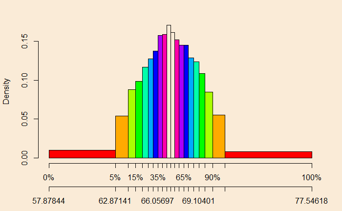
To understand the second point, equal probability groups, let me add another scale to the X-axis:

Now find the area of any block, e.g. the left red = (62.87 – 57.88) x 0.0093 = 0.046. The next brown = (63.80 – 62.87) x 0.053 = 0.049. Finally, one of the white boxes = (66.98 – 66.69) * 0.17 = 0.049. Now you know the probability groups.
Compare actual with theory
In q-q, you collect the values of various quantiles of your data and plot them against the theoretical quantiles of a specified (normal, chi-squared, etc.) distribution. Since it is theory vs actual, and if they perfectly match, you should get a diagonal straight line.
Before we close
We will do the exercise another time. I will also show you the various R codes used in this post.

