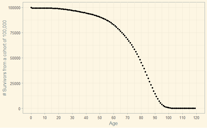
We have seen the calculations behind life expectancy, the lifespan of a hypothetical cohort ageing based on the measured mortality rates of a given period, as a statistical projection of the current conditions. Here, we plot the life expectancy that we estimated previously.
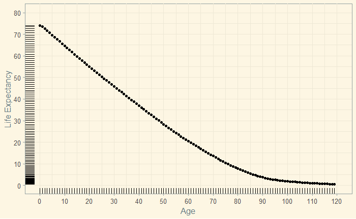
library(tidyverse)
library(ggthemes)
L_data %>% ggplot(aes(Age, Life.Exp)) +
geom_point() +
   geom_rug() +
  scale_x_continuous(name="Age", limits=c(0, 120), minor_breaks = seq(0, 120, 5), breaks=seq(0, 120, 10)) +
  scale_y_continuous(name="Life Expectancy", limits=c(0, 80), minor_breaks = seq(0, 80, 5), breaks=seq(0, 80, 10)) +
 theme_solarized(light = TRUE)
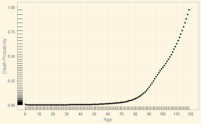
The death probability (data) at each age is presented below.
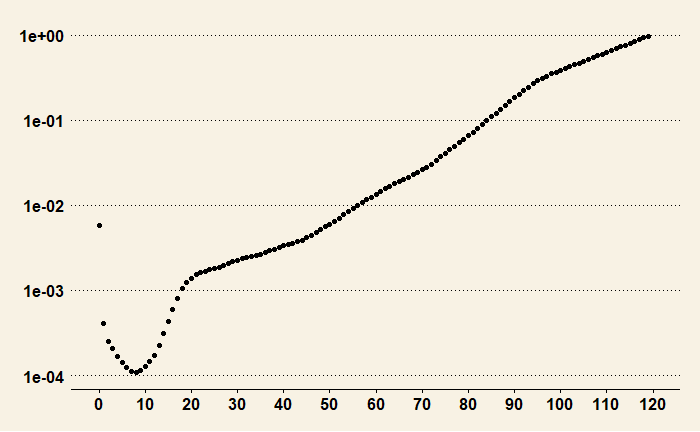
The plot with the Y-axis in the logarithmic scale shows finer details, especially in the lower age categories.
You can see below the dynamics of survival – 85,000 of the 100,000 are alive until almost the age of 60.
