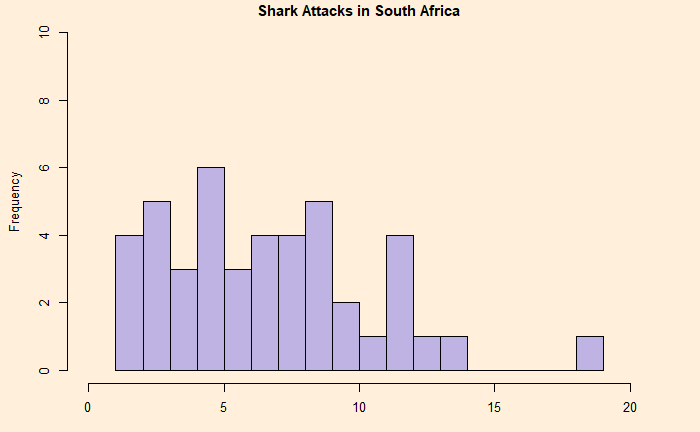
People often quote shark attacks as examples for explaining randomness. For one, they have been sporadic. For example, here are statistics from South Africa.

Global Shark Attack – Worldmarising the Statistics.

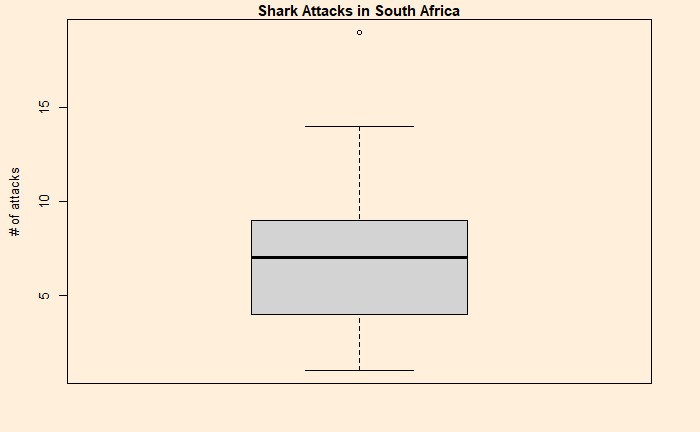
The plot looks decent except for one outlier – 19 – in 1998.
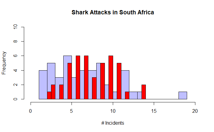
One way to understand the pattern is to run a simulation assuming randomness and then compare the outcomes. Poisson distribution is best suited to make the check. Here is what we can do.
First, we plot the distribution of the actual data (in blue), followed by a comparison with the Poisson (in red).


Except for the outlier, the two plots are reasonably in agreement. Then, what about the shark attacks in Australia? That comes next.

