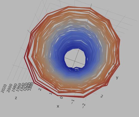
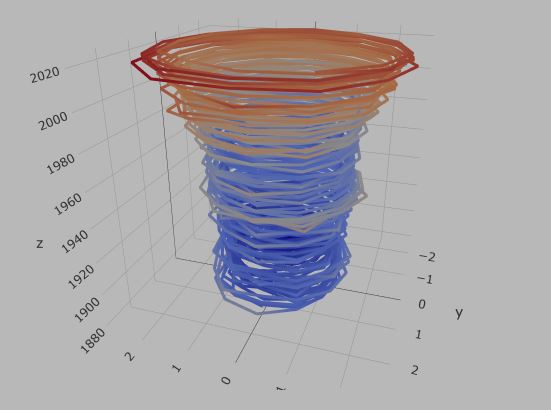
In the last post, we initiated the plotting of the abnormal temperature differences over the years (from the standardised values) thought to have been arising out of global warming. Today, we will build the famous spiral plot to visualise it.
First, we transform the data to polar coordinates.
c_data <- c_data %>% select(Year, all_of(month.abb)) %>%
  pivot_longer(-Year, names_to = "Month", values_to = "T_diff") %>%
  mutate(Month = factor(Month, levels = month.abb)) %>%
  mutate(Month_no = as.numeric(Month), radius = T_diff + 1.5, theta = 2*pi*(Month_no-1)/12, x = radius * sin(theta), y = radius * cos(theta), z = Year)
The input (the original table) and the output (the transformed table) are presented below.


Plotly
Plotly is an open-source graphing library, which also has one for R (plotly).
plot_ly(c_data, x = ~x, y = ~y, z = ~z, type = 'scatter3d', mode = 'lines',
        opacity = 1, line = list(width = 6, color = ~T_diff, reverscale = FALSE))


