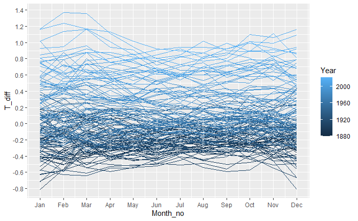
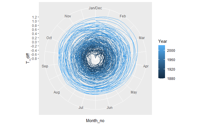
Let’s construct a visualisation of global temperature change – from 1880 – similar to what the British climate scientist Ed Hawkins did. The data used in the exercise has been downloaded from the GitHub channel of Riffomonas. He tabulated the deviation in the annual global mean from the data normalized between the temperatures 1951 – 1980.

The first step is to pivot the data into the following format:
c_data <- read.csv("./climate.csv")

c_data <- c_data %>% select(Year, all_of(month.abb)) %>%
  pivot_longer(-Year, names_to = "Month", values_to = "T_diff") %>%
  mutate(Month = factor(Month, levels = month.abb)) %>%
  mutate(Month_no = as.numeric(Month))
Next, we plot the data we built.
c_data %>% ggplot(aes(x = Month_no, y = T_diff, group = Year, color = Year)) +
  geom_line() +
  scale_x_continuous(breaks = 1:12, labels = month.abb) +
  scale_y_continuous(breaks = seq(-2, 2, 0.2)) +
  coord_cartesian()
Add a line to change to polar coordinates.
c_data %>% ggplot(aes(x = Month_no, y = T_diff, group = Year, color = Year)) +
  geom_line() +
  scale_x_continuous(breaks = 1:12, labels = month.abb) +
  scale_y_continuous(breaks = seq(-2, 2, 0.2)) +
  coord_polar()
Climate data: Riffomonas
Riffomonas Project: Youtube
Climate spiral: Wiki

