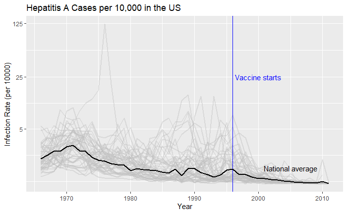
We have seen how good visualisation helps communicate the impact of vaccination in combating contagious diseases. We went for the ’tiles’ format with the intensity of colour showing the infection counts. This time we will use traditional line plots but with modifications to highlight the impact. But first, the data.
library(dslabs)
library(tidyverse)

vac_data <- us_contagious_diseases
as_tibble(vac_data)
‘count’ represents the weekly reported number of the disease, and ‘weeks_reporting’ indicates how many weeks of the year the data was reported.
The total number of cases = count * 52 / weeks_reporting. After correcting for the state’s population, inf_rate = (total number of cases * 10000 / population) in the unit of infection rate per 10000. As an example, a plot of measles in California is,
vac_data %>% filter(disease == "Measles") %>% filter(state == "California") %>%
  ggplot(aes(year, inf_rate)) +
  geom_line()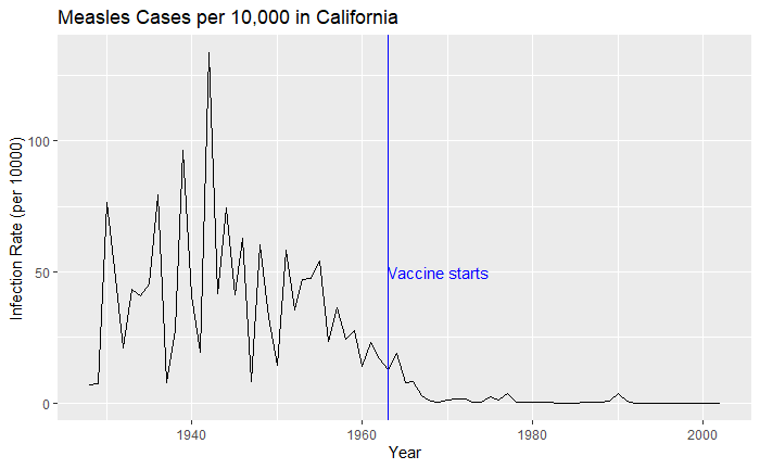
Extending to all states,
vac_data %>% filter(disease == "Measles") %>% ggplot() +
geom_line(aes(year, inf_rate, group = state)) 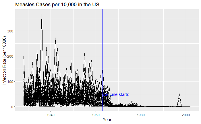
Nice, but messy, and therefore, we will work on the aesthetic a bit. First, let’s exaggerate the y-axis to give more prominence to the infection rate changes. So, transform the axis to “pseudo_log”. Then we reduce the intensity of the lines by making them grey and reducing alpha to make it semi-transparent.
vac_data %>% filter(disease == "Measles") %>% ggplot() +
  geom_line(aes(year, inf_rate, group = state), color = "grey", alpha = 0.4, size = 1) +
  xlab("Year") + ylab("Infection Rate (per 10000)") + ggtitle("Measles Cases per 10,000 in the US") +
  geom_vline(xintercept = 1963, col ="blue") +
  geom_text(data = data.frame(x = 1969, y = 50), mapping = aes(x, y, label="Vaccine starts"), color="blue") +
scale_y_continuous(trans = "pseudo_log", breaks = c(5, 25, 125, 300)) 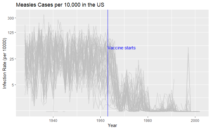
What about providing guidance with a line on the country average?
avg <- vac_data %>% filter(disease == "Measles") %>% group_by(year)  %>% summarize(us_rate = sum(count, na.rm = TRUE) / sum(population, na.rm = TRUE) * 10000)

geom_line(aes(year, us_rate),  data = avg, size = 1)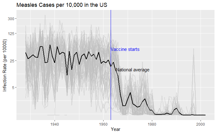
Doesn’t it look cool? The same thing for Hepatitis A is:
