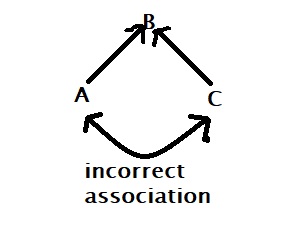
We saw what collider bias is. It happens when two variables, e.g., risk factor and outcome, influence a third, namely, the likelihood of being sampled. Graphical representations of such associations are often achieved with the help of directed acyclic graphs (CAG) or causal diagrams. If B is a common effect or collider of A and C, the situation is represented as:

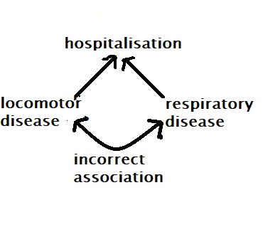
An example is the famous “admission rate bias” (Sackett, 1979) when he analysed hospitalised patients with locomotor and respiratory disease and found an association. He found no such relationships when he repeated the same experiment in the general public. The presence of a collider, ‘hospitalisation’, distorted the analysis.

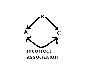
Look at the following case: Does it remind you of something?

The arrows are pointing away from a common cause, B. It is confounding, and we have seen this before.

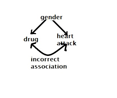
Since gender is associated with heart attack and preference for taking the drug, unless the study estimates are gender-adjusted, deriving conclusions has a high chance of leading to incorrect associations between drug and heart attack.

