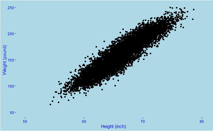
We know about scatter plots and line plots. The idea is to show the relationship between two variables. We have seen in the past the human height vs weight relationships. And also how the data is distributed. Note these are typically simulated data based on past surveys such as the Growth Survey of 1993. Let’s look at one such relationship.

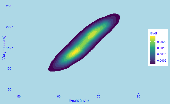
You see a clear relationship between weight and height. But nothing further than that. For instance, there could be different intensities in how they are distributed; that is lost inside the multitudes of dots. Density plots come in handy in such cases. Here is a 2D density plot.

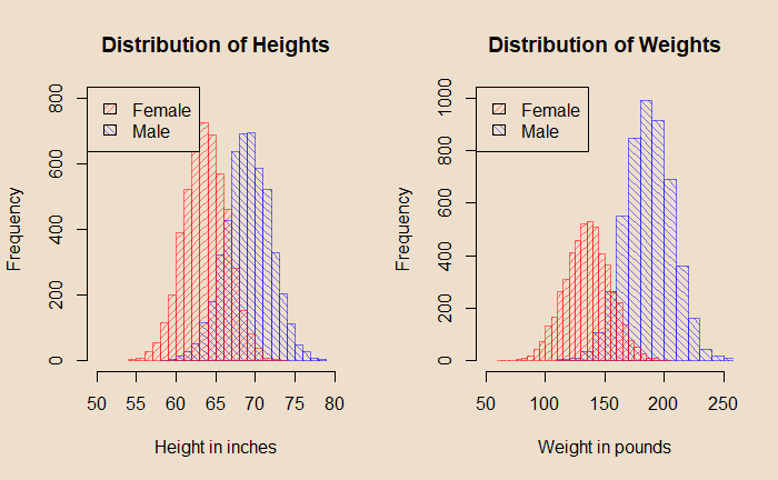
The contours represent the intensity; the yellow colour means heavy traffic. Therefore, the 2D density plot has combined two things: the X-Y scatter (the one on top) and the two distributions (shown below).

The R code for creating the 2D density plot is:
h_data %>% ggplot(aes(x = Height, y=Weight) ) +
  stat_density_2d(aes(fill = ..level..), geom = "polygon") +
    scale_fill_viridis_c()
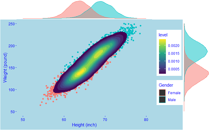
Or a real fancy plot like the following that combines everything!

library(tidyverse)
library(ggExtra)

plot <- h_data %>% ggplot(aes(x = Height, y=Weight ) ) +
geom_point(aes(colour = Gender)) +
stat_density_2d(aes(fill = ..level..), geom = "polygon") +
  xlim(50, 80) +
  ylim(50, 250) +
  xlab("Height (inch)") +
  ylab("Weight (pound)") +
  theme(text = element_text(color = "blue"),
        panel.background = element_rect(fill = "lightblue"),
        plot.background = element_rect(fill = "lightblue"),
        panel.grid = element_blank(),
        axis.text = element_text(color = "blue"),
        axis.ticks = element_line(color = "blue")) +
  scale_fill_viridis_c()

  ggMarginal(plot, type="density",groupColour = TRUE, groupFill = TRUE)
